Redesigning how LSEG analysts manage tasks and search data
Timeline3 months
Team4 (2 UX, Design Lead, PO)
RoleProduct Designer
Context
At LSEG, analysts use internal tools to manage high-volume financial data and time-sensitive work. Over
time, these tools had grown fragmented across systems, each with different assumptions and interaction
patterns.
This fragmentation didn’t block work outright, but it added constant friction. Analysts spent time
navigating tools, validating data, and tracking ownership instead of focusing on analysis.
I worked as part of a cross-functional team to reduce this friction by stabilising core workflows and
improving clarity across task management and search.
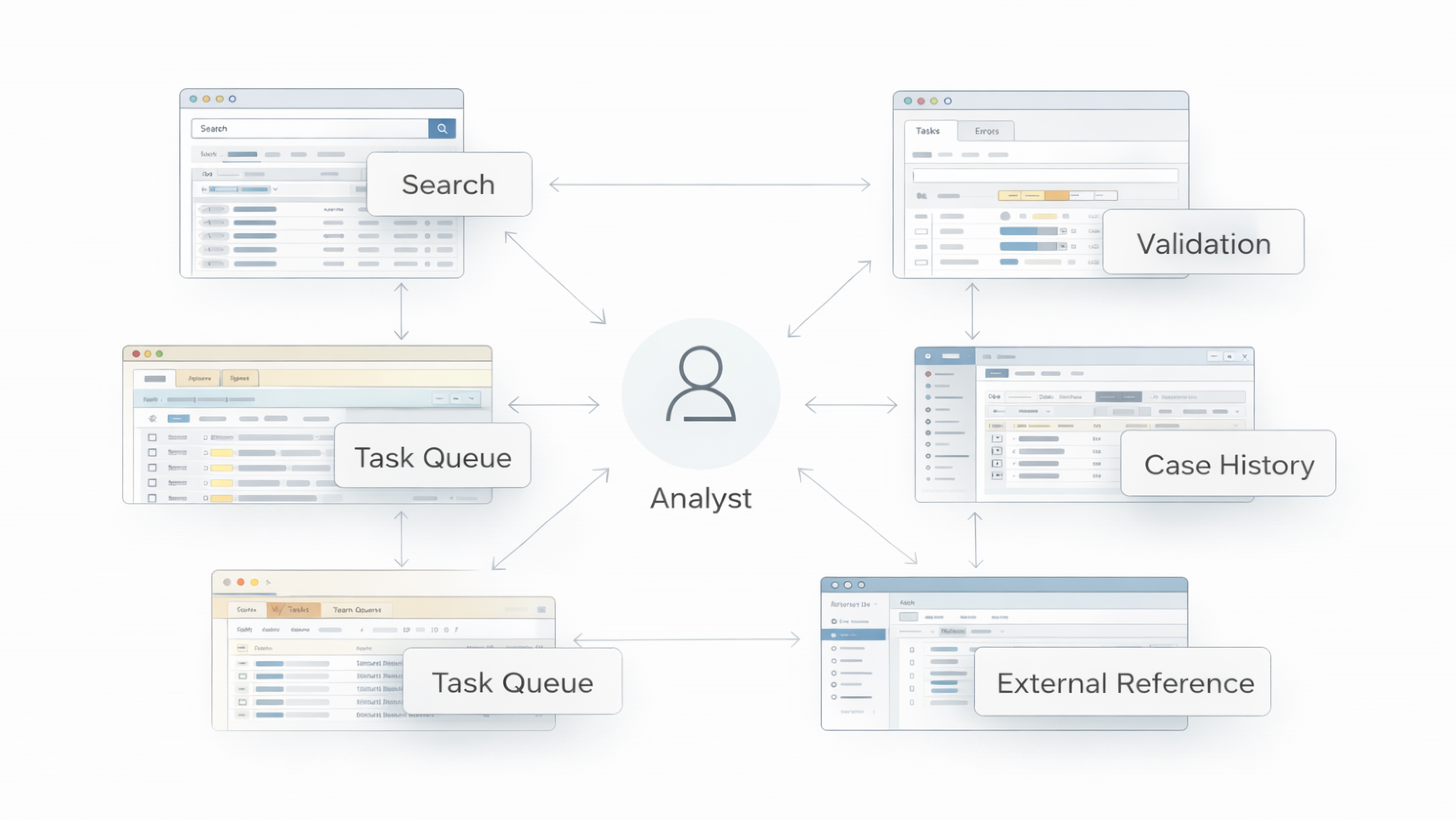
Ecosystem overview of fragmented tools
The problem
Scattered systems made simple work harder than it should have been.
Analysts worked across multiple tools to complete a single task, but the experience wasn’t cohesive.
Search results weren’t always trusted, ownership wasn’t clearly visible, and the same company could surface
differently depending on the system in use.
To compensate, analysts relied on spreadsheets, notes, and side channels. What should have been a
structured and traceable process became fragmented and mentally taxing, increasing the risk of delays and
duplicated effort.
Goals
Reduce friction across task flows
Improve confidence in search and ownership
Support clearer handoffs and next steps
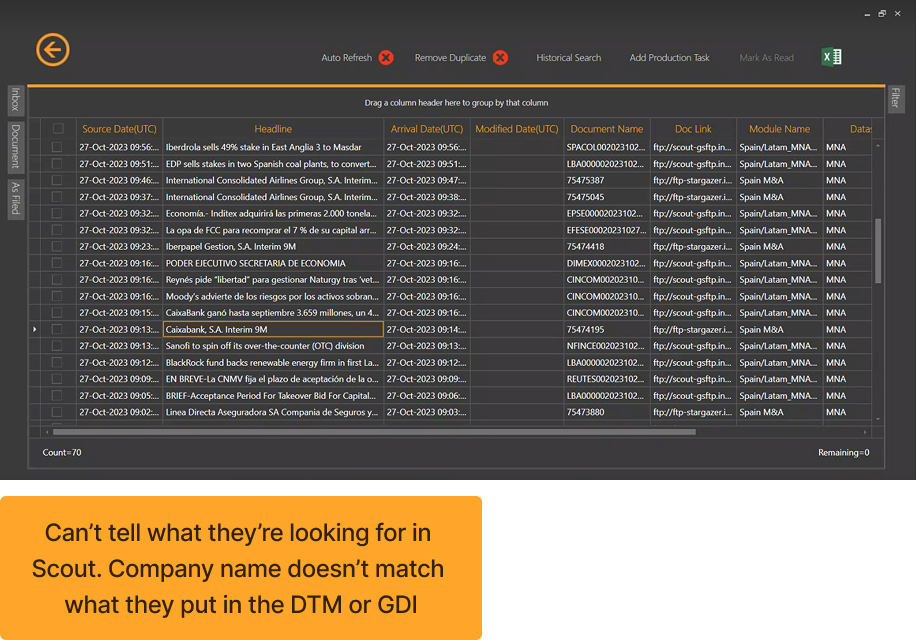
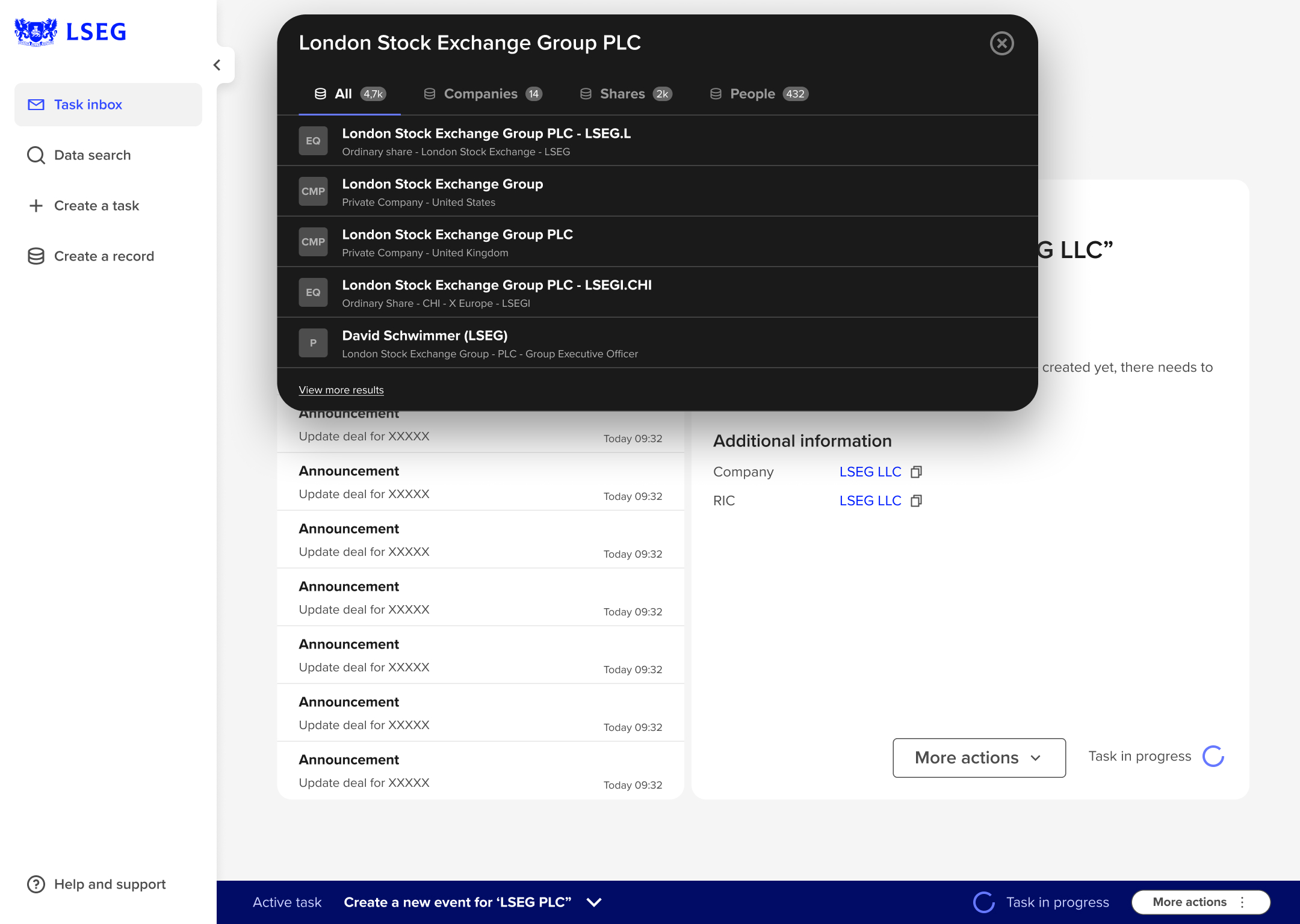
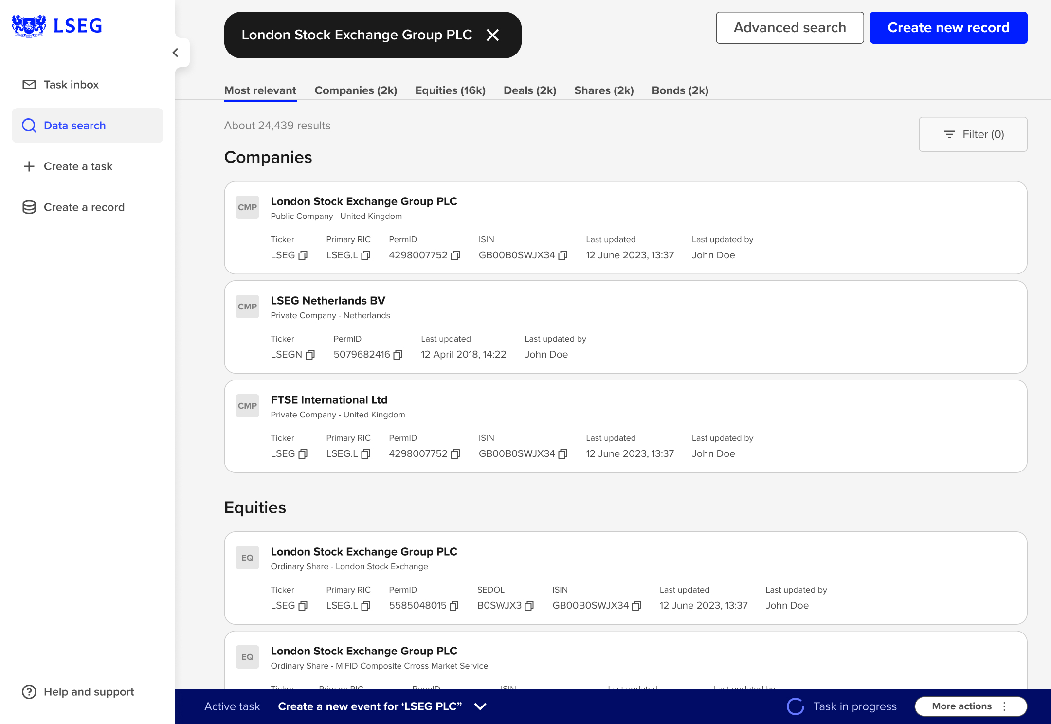
One example of mismatched company identifiers in Scout. This was just one system — across the wider ecosystem,
the “same” company could show up differently, which pushed analysts to track context outside the tools.
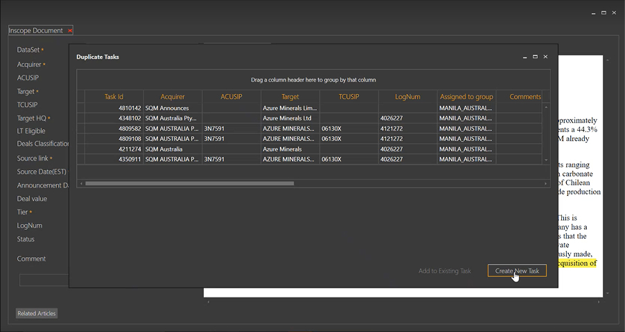
Duplicate tasks for the same target created extra reconciliation work and slowed handoffs.
Discovery
We started with stakeholder alignment sessions, followed by interviews and observations with analysts
across multiple domains.
Beyond interviews, we focused on how work actually moved day to day — tool-switching, hesitation around search results,
and reliance on external trackers. Those behaviours surfaced gaps that weren’t always explicitly stated.
Findings were synthesised through affinity mapping and journey mapping, then translated into a service
blueprint mapping analyst actions against systems, ownership, and dependencies. This became a shared
reference throughout the project.
Service blueprint used to map analyst actions against systems, ownership, and dependencies.
What we found
Systemic breakdowns, not isolated issues
Fragmented tools and workarounds
Analysts relied on spreadsheets and notes to bridge gaps between systems, which meant coordination was
happening outside the product.
Duplicate records
Overlapping entities and inconsistent validation reduced trust in search results and led to repeated
work.
Unclear task ownership
Handoffs lacked visibility, creating delays and uncertainty around next steps.
These weren’t isolated usability issues. They were structural problems affecting multiple teams.
Design direction
The direction was anchored around outcomes, not abstract principles. The friction wasn’t coming from one broken
feature — it was accumulating across everyday workflows.
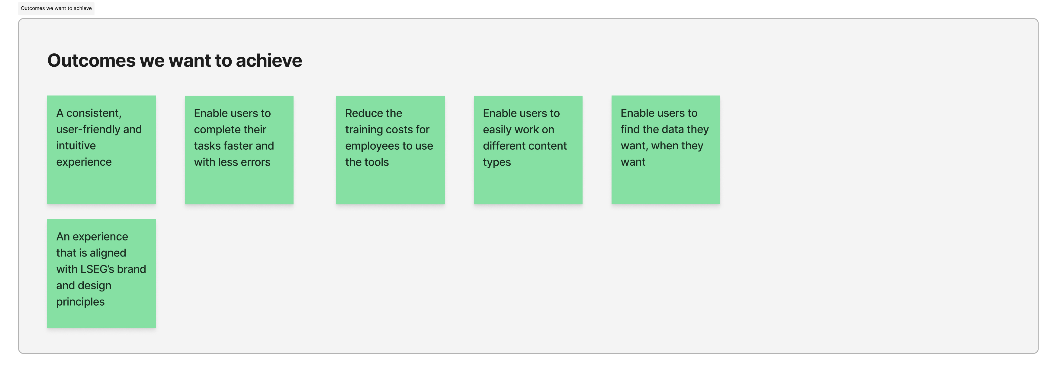
Shared outcomes used to guide decisions across design, product, and engineering.
We aligned on outcomes like faster task completion, fewer errors, clearer ownership, easier onboarding,
and consistency with LSEG’s design standards. This became the baseline for prioritisation.
Instead of redesigning the entire ecosystem at once, we stabilised core workflows first — especially search and task flow —
because they sat upstream of most other issues and shaped analyst confidence.
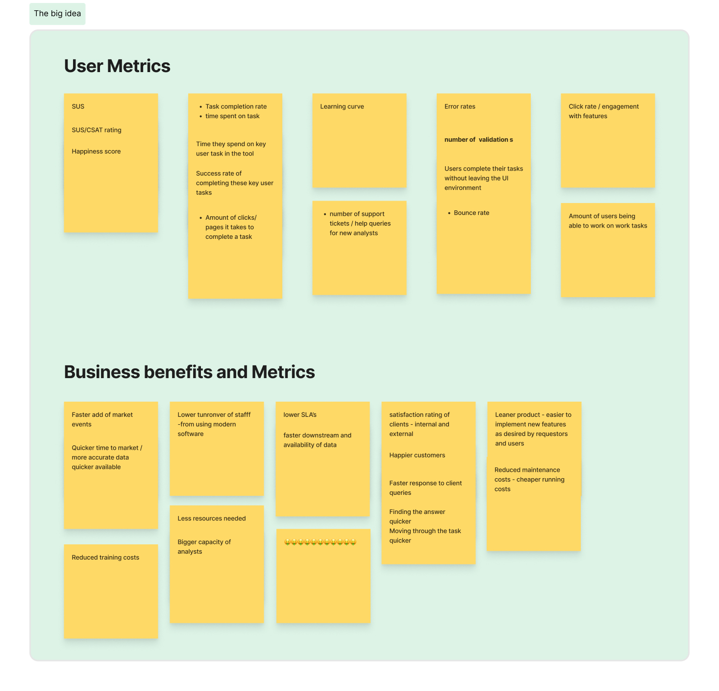
Lightweight success criteria across user behaviour, adoption, and business impact.
We also aligned on what we could realistically observe: task time, error frequency, learning curve,
support queries, and whether analysts needed fewer duplicate checks.
Design & validation
Design and validation happened in short cycles. We moved quickly into high-fidelity prototypes and tested
them with analysts as part of regular sprint work.
Feedback focused on clarity, confidence in search results, and how easily analysts could understand
ownership and next steps. Each round fed the next iteration, so we could fix things while the shape was still flexible.
“We didn’t wait until the end to validate. We kept the loop short so we could fix things while the
shape was still flexible.”
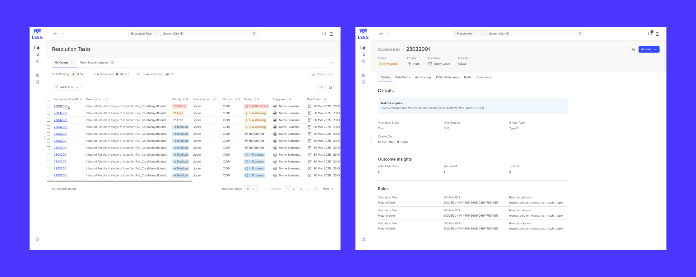
Designs
With limited time per sprint, these were early prototypes focused on clarity over visual polish.
We user tested them with analysts within a single sprint to validate the direction quickly.
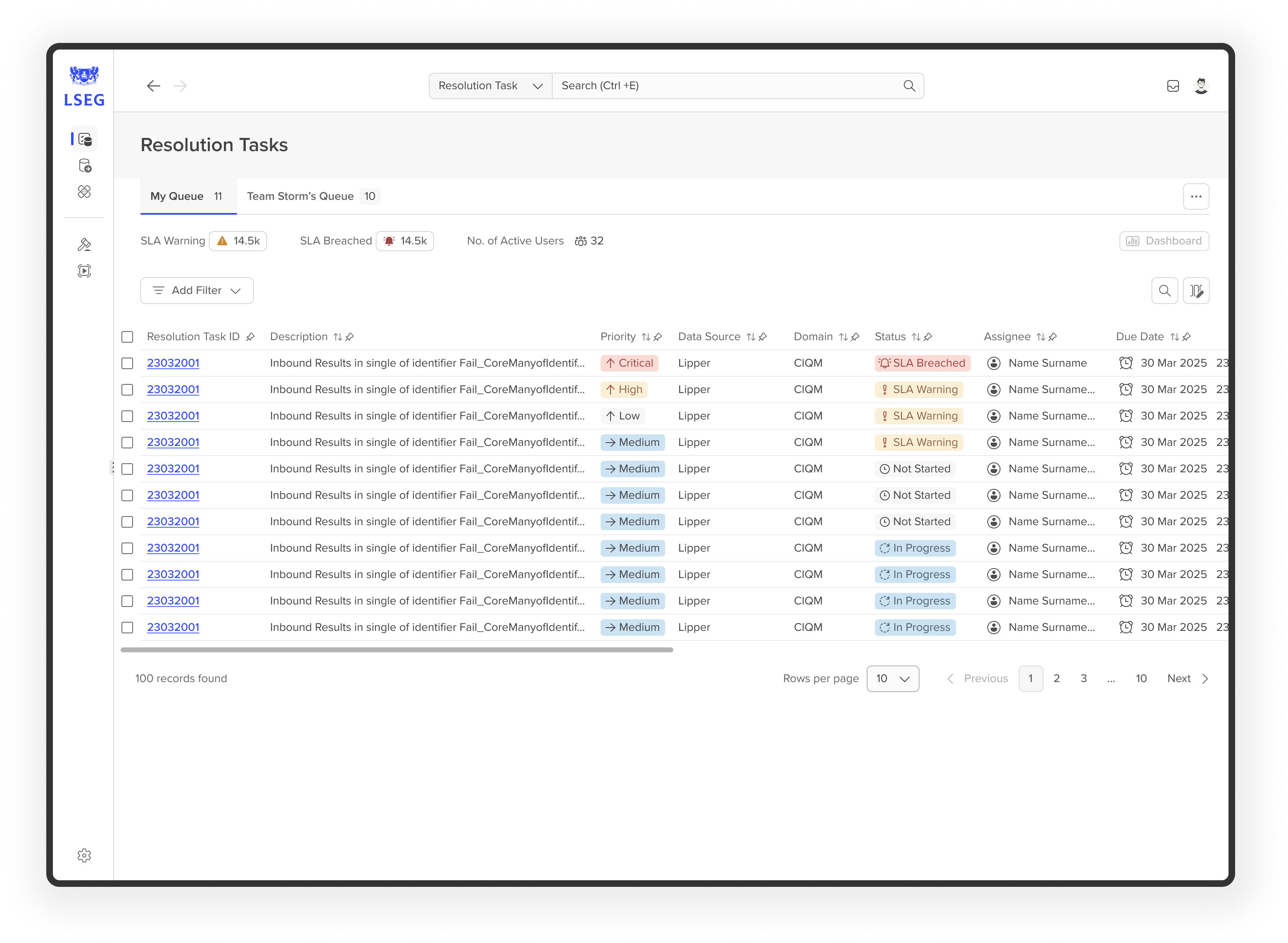
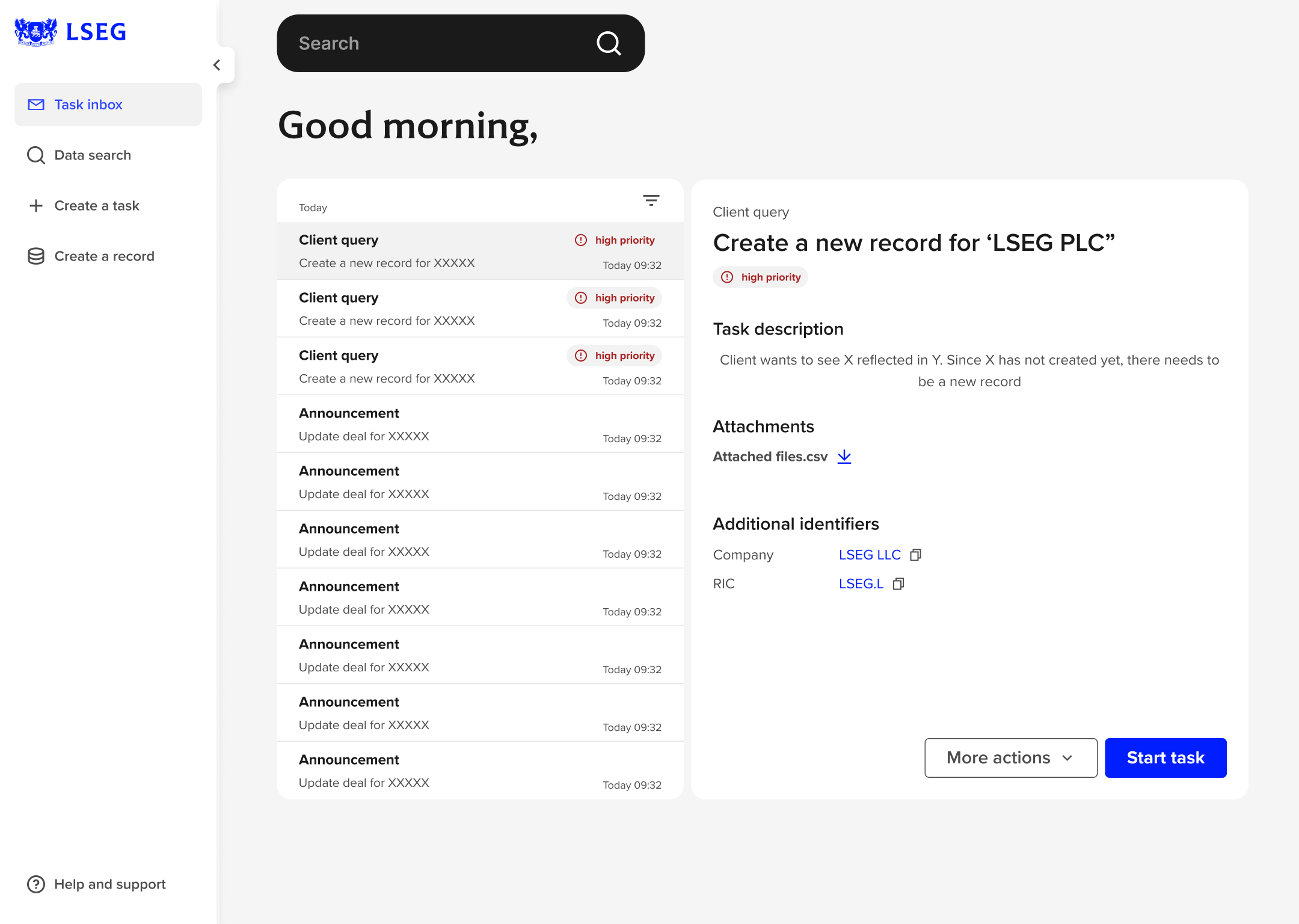
Task details and ownership at a glance
Priority, task context, and identifiers are visible upfront so analysts don’t have to click around
just to understand what they’re looking at.
Outcome: Fewer missed details and faster “what do I do next?” decisions.
Search validation cues
Search results surface clearer identifiers and entity context upfront, so users can confirm a match
without opening multiple records.
Outcome: Reduced hesitation during search and fewer duplicate checks.
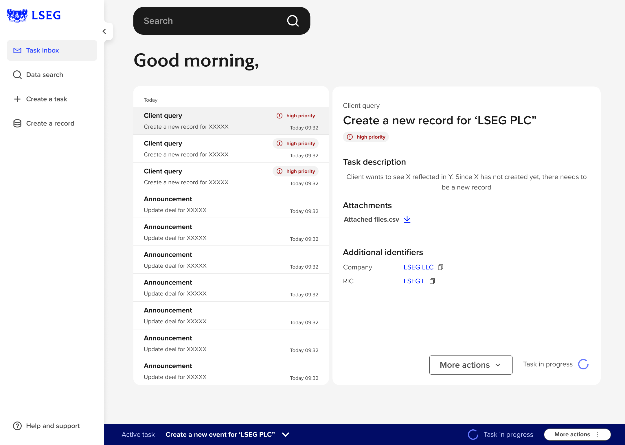
Clearer task state and handoffs
Task state is explicit and consistent, so it’s obvious what’s in progress vs done, and where work is getting handed off.
Outcome: Better continuity and traceability across handoffs.
Metadata surfaced earlier
Key fields show up at the point of decision so analysts don’t have to bounce between screens to validate basic context.
Outcome: Faster decisions with less back-and-forth.
What’s next
Following the initial sprint, subsequent iterations focused on extending the same patterns across task creation,
search, and exception handling.
As the platform evolved, designs were adapted for different CIQM domains while keeping core behaviours consistent.
This reduced re-learning and made cross-domain work feel familiar rather than fragmented.
What I’d do differently
Introduce lightweight, quantifiable signals earlier in the research to complement qualitative insights and make trade-offs clearer across sprints.
Bring design system considerations in earlier to keep patterns aligned as the work scales across teams and domains.
Track insights across sprints in a more structured way to surface recurring themes sooner, instead of rediscovering them sprint by sprint.